Step by step
Published by Josh on Sunday, April 15, 2007 at 1:56 PMI do these screencaps from time to time because everyone seems to love them.
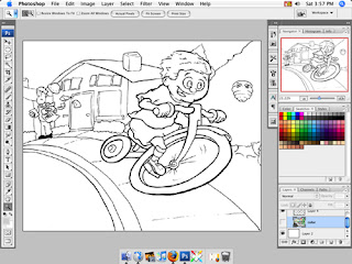
Here's the inked drawing after I have scanned it in, bumped up the contrast to get rid of any stray pencil marks and fixed anything that I goofed up earlier.
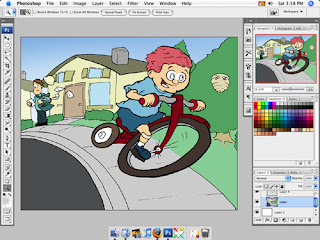
Next I start laying down the base colors. I always get nervous during this part because it makes the drawing look terrible with all those flat colors. I choose mid-range tones so that I can add layers of color, both darker and lighter, to give it a lot of depth. That's why his hair looks so pink but, trust me, it will get better.
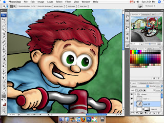
I create the painterly look with a by adding light 'washes' of color in photoshop. I am still expanding my palette to get a more realistic tone to my characters but I guess that is a never-ending process. Here you can see what it looks like after painting for a couple of hours. I erase endlessly and undo even more until I get it to where I like it.
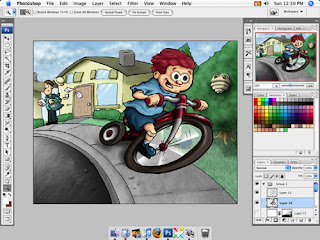
Done! I tweak endlessly, making his eyelids smaller, etc. I use a lot of different techniques to get the textures for the road, clouds, trees, hair, etc, but most of it is done with custom photoshop brushes I have made over time. I try to do less detail work in the background to make sure it doesn't draw you away from the focus of the picture. I might go back and lighten the background a little more, but I'll let it rest for now.
1 Comment:
-
April 15, 2007 at 11:06 PM
See! Tweaking already needed. I forgot his freckles. Oh well.
Subscribe to:
Post Comments (Atom)